
Colourful Orthodoxy
Dear All,
Apologies for the gap between the last and this- life has been both busy and upsetting; and very much the same (i’m sure all of you in lockdown in the UK can sympathise!). As a result I am not thrumming with new thoughts on architecture. However, a couple of articles I read this week did get me thinking.
The first was a review of David Mountain’s new book- Past Mistakes: How We Misinterpret History and Why it Matters. He reminded me of the myth I have been all too ready to swallow of the ‘pure’ white forms of classical sculpture and architecture.
For of course, though we chose to misremember, and in the past archaeologists even destroyed evidence of it, the Parthenon was not white, the Elgin marbles were not white, and the (gothic) stone carvings at Cluny were so garish they caused St Bernard of Clairvaux to complain they were distracting the monks. The crisp white pillars we use to hold up all our institutions (financial and cultural) are all a misinterpretation of the historical precedent they seek to find authority in. Politics is for another day though!

In ‘the old days’ coloured pigments were so expensive that quite simply the gaudier the building, the wealthier the patron was considered to be (finally something that makes sense in Donald Trump’s aesthetic!). Of course, many of us find this polychromy jarring, so used as we are to simplicity and pure form suggesting authority and wealth. In simplicity there are so few opportunities to hide mistakes or dirt, implying high quality craftsmanship and staff to clean.
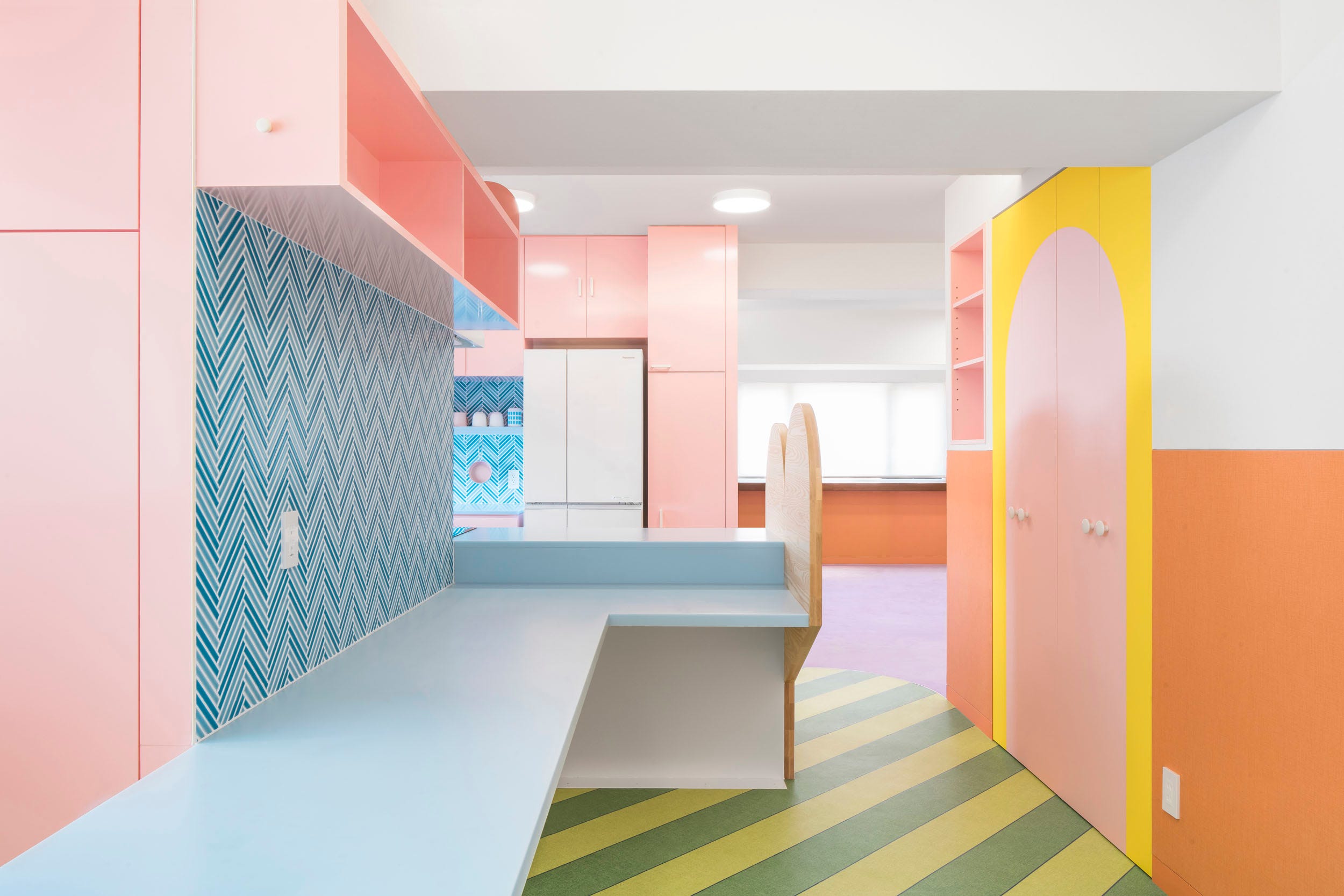
Whenever this level of saturation is discussed it brings to my mind the work of designer Adam Nathaniel Furman with whom I am an occasional twitter correspondent (his dog is adorable- follow him for that alone!). His work is almost garish and frankly much of it makes me feel uncomfortable largely because of the boldness with which he uses colour. Saying this, if I could justify the expense of buying one of his mirrors I would!
But to follow this thread through to the great trend of 2020/ 2021- our homes, given we may never be allowed to leave them again. He designed an apartment in Tokyo which smashes all the Scandinavian inspired, Ikea sanctioned, conventions that so many of us fall into (my flat is largely in tones of wood, white, grey and green so I am equally guilty!). It is mesmerising, and though I am not sure I could live with it it is perhaps exactly the kind of design we need more of.

Architect and TV presenter Michelle Ogundehin recently wrote a thought provoking piece for Dezeen that concluded that the discomforts and uncertainties of 2020 may be exactly what we have needed- that “we must understand, even if not accept, polarising points of view”. She continued this thought into home design- stating that the best homes “are about the feeling they give you not the stuff they contain, the "right" colours or "hot" looks… if we intentionally create more supportive spaces in which to live, i.e. spaces which reflect our authentic likes and lives rather than anything dictated externally, we will be more able to weather the myriad messy curveballs of life itself. ”
So in this spirit I hope you are in a home in which you can feel authentically you, that you are able to question orthodoxy- architectural or not- which strikes a discord; and that you are also able to find joy this week in discovering something you thought you had forgotten, and freedom in the discomfort we are all facing.
Until next time
Eleanor